

Moonflower —
Sustainable Fashion
with a West Coast Twist.

The Problem —
First Impressions are
a make or break moment
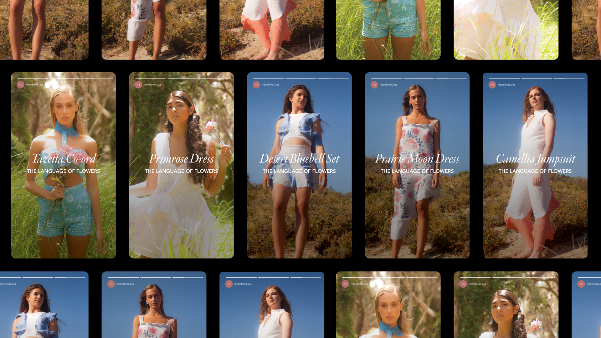
Moonflower is a ready to wear label that focuses on producing sustainable, artisan and feminine clothing. Hand crafted in Perth, Western Australia, award wining designer Annabelle Russo captures her vision of the carefree lifestyle of Western Australia through her debut collection “The Language of Flowers”.
Good Productions was approached in 2019 to design her visual identity which will support her first collection “The Language of Flowers“. The main considerations with this job was how can we encapsulate Annabelle’s vision as well as standing out against her contemporaries. Fashion is fast paced industry and Annabelle’s label is the antithesis of this. We leaned into this and focused on crafting something that is artisan and speaks to her audience in an authentic way in which the storytelling works hand in hand with the garments.
The Process —
How to stand out in a
market that screams.
The crux of this brand identity came from Annabelle’s own upbringing so it was clear that she was an active collaborator in the creation of the brands voice and visuals. They needed to successfully translate her vision into something that was uniquely hers that she could express her story through the garments and in a way that was truly authentic to her. With a passionate focus on sustainability, only sourcing fabrics that were up cycled and incorporating an in-house recycling program for her garments
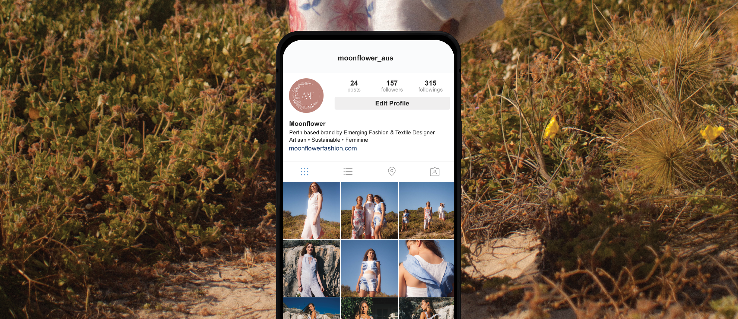
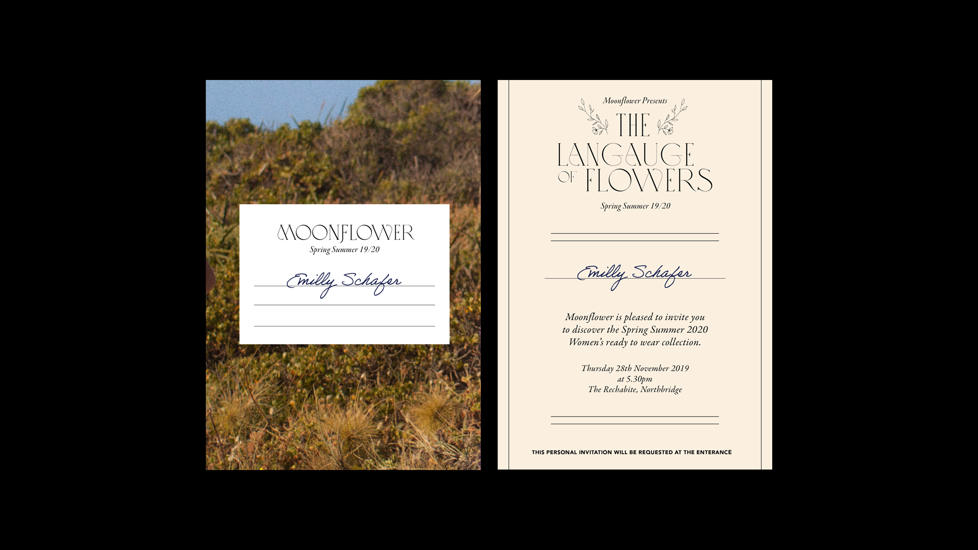
The problem is that’s every self published fashion label. So our focus became on building the brand to have an emphasis on personal service and connection. She wanted something with tender textures, you can touch it, you can smell it. Having a personal relationship with her customers is how Annabelle wanted to stand out, instead of a faceless brand- she wanted it like a Mom and Pop shop. So we drew inspiration from tactile and analog forms of communication. Think postcards, letters and envelopes. This motif is reflected in the approach we took into the collateral and presentation of the brand. However we are in the digital age so whilst this analog approach was going to set her apart she needed it to be inline with the contemporary fashion houses who were increasing there media spend on digital channels.
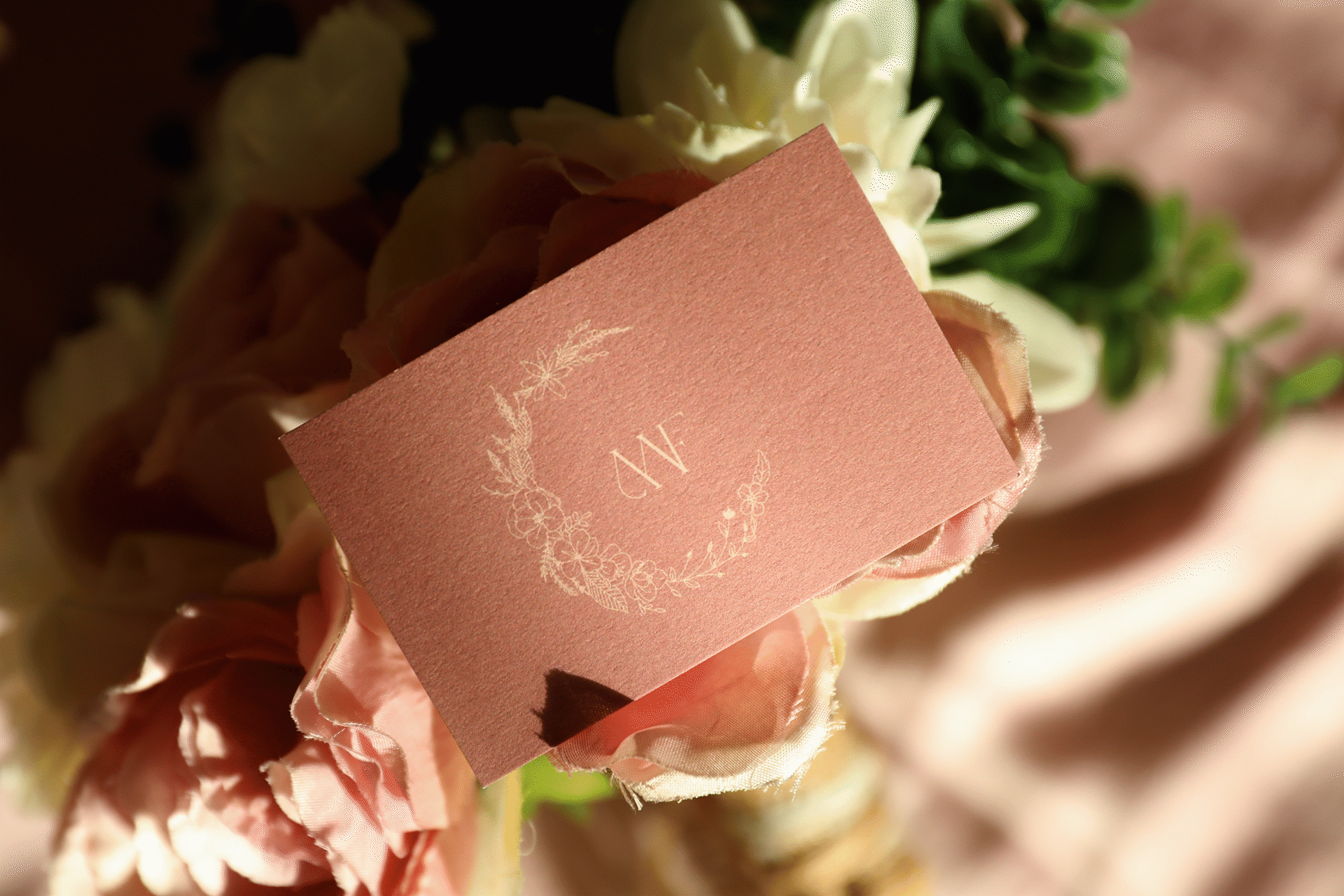
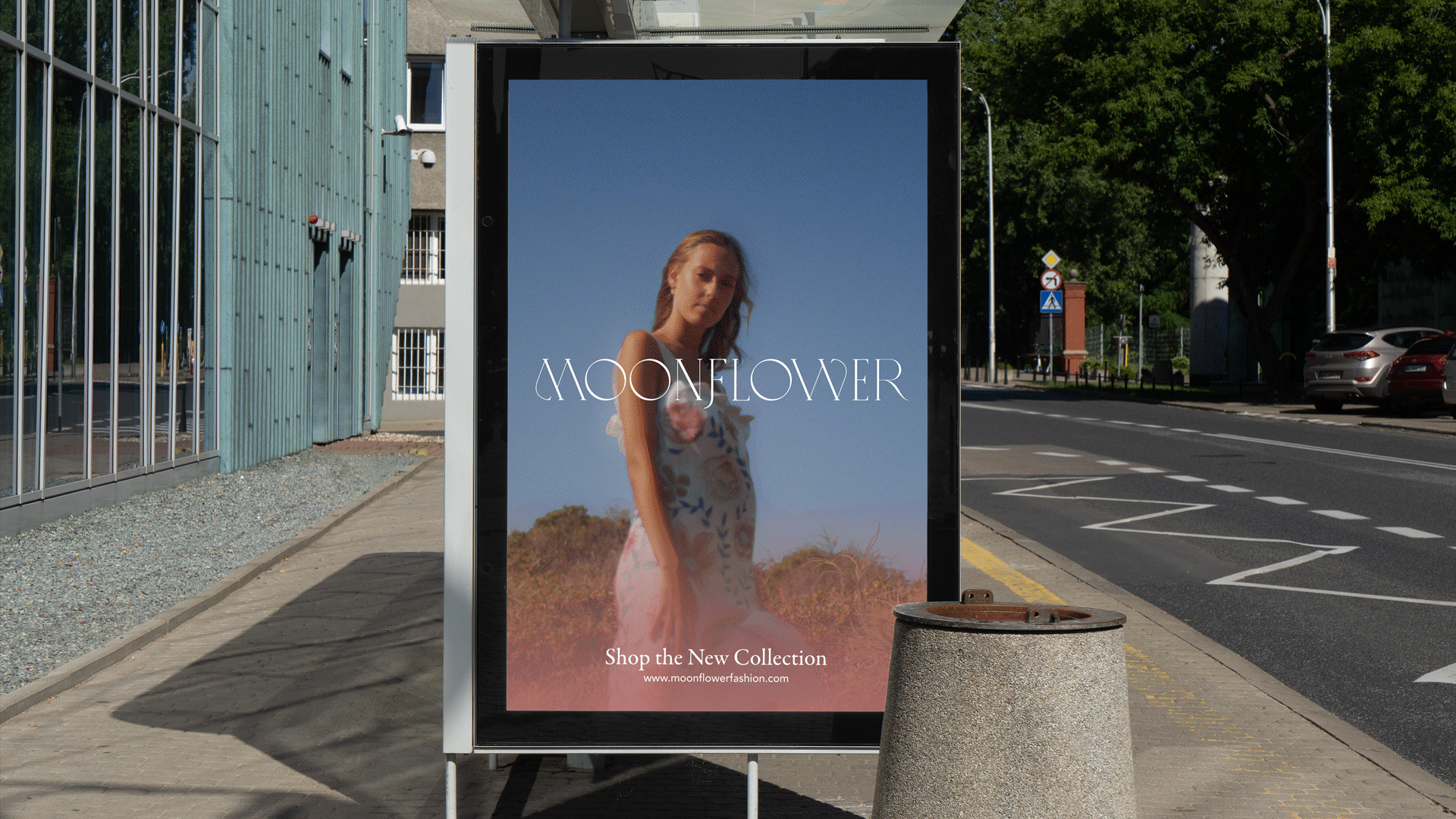
With sustainability, artisan craft and feminine centred stories being a the heart of the brand. We designed a Monogram, Logotype and Display Logo that was graceful and flexible with an artisan quality to it harkening back to ages gone by of cobble and stone boutiques that used to house the nooks and crannies of suburbs like Cottesloe and Fremantle. The typography also goes back to these heritage roots with a decorative serif but is paired with a flexible sans serif to gracefully balance it. Visually the brand encapsulates strong feminine focus with its elegant garments at the forefront backlit by a calming west coast beaches - just like Annabelle’s upbringing.


Project Credits
-
Charli Wheeler
Ellie Bogdanich
Olivia Ozbaki
Zia Palmer
-
Amia Nardi
Blake Good
-
Shannon Skinner
-
Annabelle Russo
-
Mike Boag
Cameron Cruz